La Perle’s IGA
Redesigning online grocery shopping for the savvy saver

Problem
Users need to easily shop and save through LaPerle’s website so they can get the groceries they need delivered.
Navigation drop-down menu: Featuring categories of products, photos of products, pricing, and descriptions
Checkout and Delivery screens: Easy way to add items to your cart, schedule a delivery.
Sale Item subcategories: Drop-down menu featuring the different sale categories
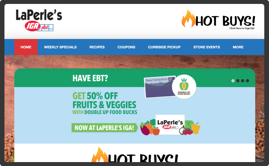
Current Site: What’s missing?
La Perle’s IGA is a local grocery store located in New Hampshire. The task was to convert it into a functional eCommerce site using research and usability testing to find an appropriate fit.
Persona
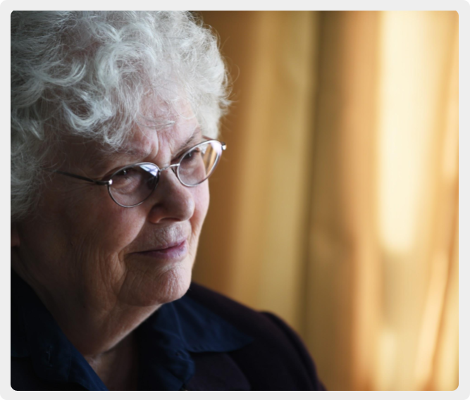
Mildred Williams
65-75 year old retired college professor
Loves a great deal and lives on a tight budget. Due to recent surgery, she cannot in-store shop.
She remembers the days of clipping coupons and writing checks at the grocer check out.
Wants to support LaPerle’s rather than a big-box brand. This has led her to online shopping but experience navigating the website has been frustrating.
Research
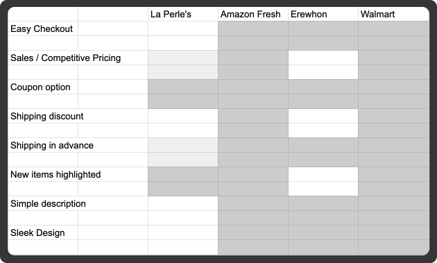
Competitive analysis
Comparing large grocery chains like Amazon Fresh and Walmart and a smaller, local chain Erewhon gave insight into how they utilize their site, and what was needed at LaPerle’s. What we needed:
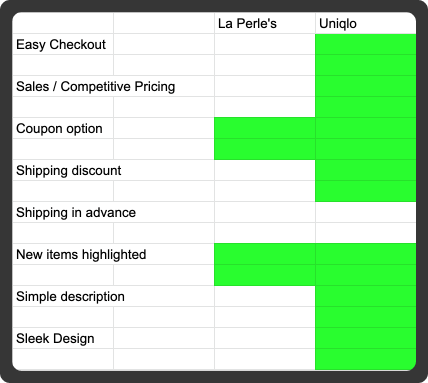
Comparative Analysis
Uniqlo is known for its fantastic clothing deals, being that Mildred is a deal-diver this would be somewhere to take note of. The sales are clearly shown on the product photo, with comparative savings on each item.

Card Sorting
In order to sort through the various products, I conducted an open and closed card sort with a few people, (and myself). This allowed me to organize all the products in the store so that users could easily find what they were looking for in the navigation based on the department.
Process
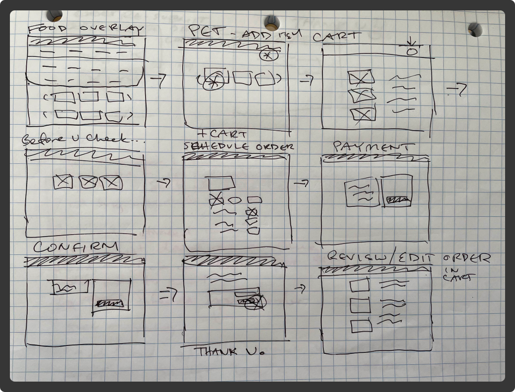
Taking inspiration from competitor websites, sketching, and going into Figma to create mid-fidelity prototypes. I would go back and forth in this process until I could visually see what worked and what wasn’t working for me - then it was time for testing.
Sketches

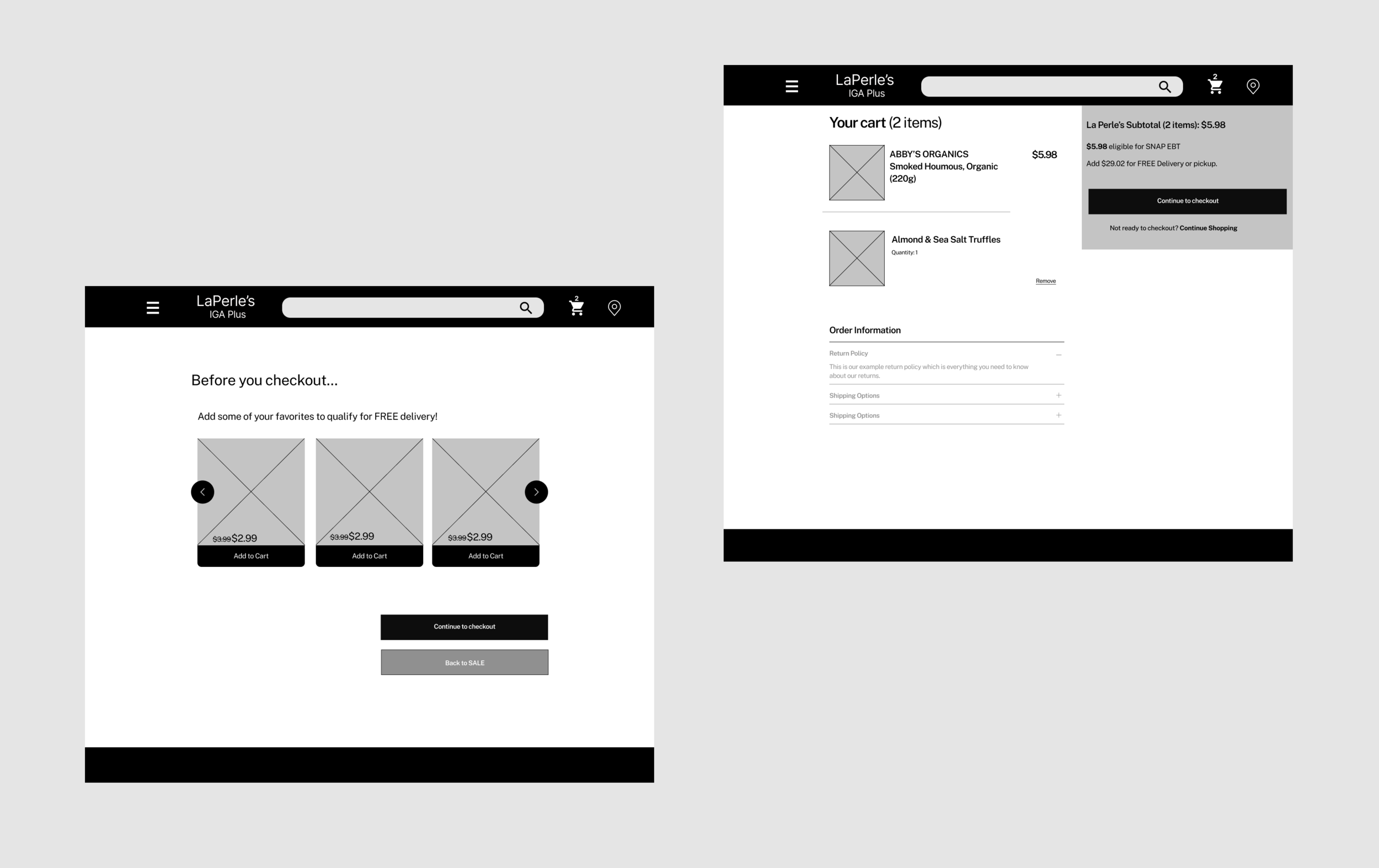
Flow 1: Sale And Checkout
Adding sale items, viewing items in cart, making changes.
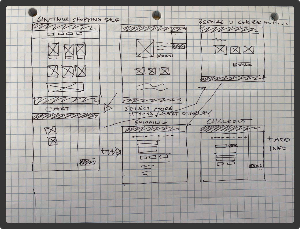
Continue Shopping
More shopping to qualify for free shipping, scheduling delivery, and making a payment.
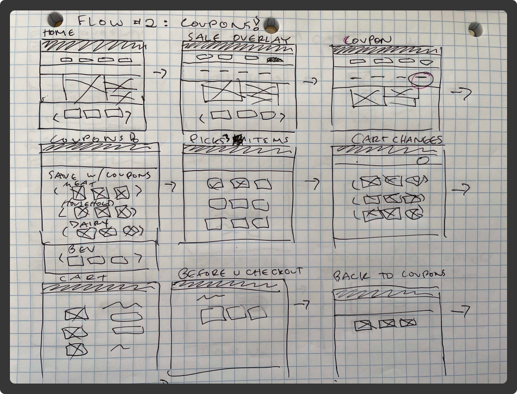
Flow 2: Coupons
Mildred navigates to the coupon section through the drop down menu.
Pet items, Checkout
She navigates back to find specific items for her pet, qualify for free shipping, schedule an order, checkout, and even edit the order after it is placed.
Mid-Fidelity Wireframes
Usability Testing
3 out of 4 people thought that the “Before you checkout” page was redundant, somewhat of an annoyance
No “go back” button or an option to go back to shopping only one way to check out is frustrating
2 out of 4 people stated that the margins on the cart subtotal page were too far out
2 out of 4 people thought the color fill in the checkout box was too dark
1 out of 4 thought items to cart without dropdown was not obvious
Solution
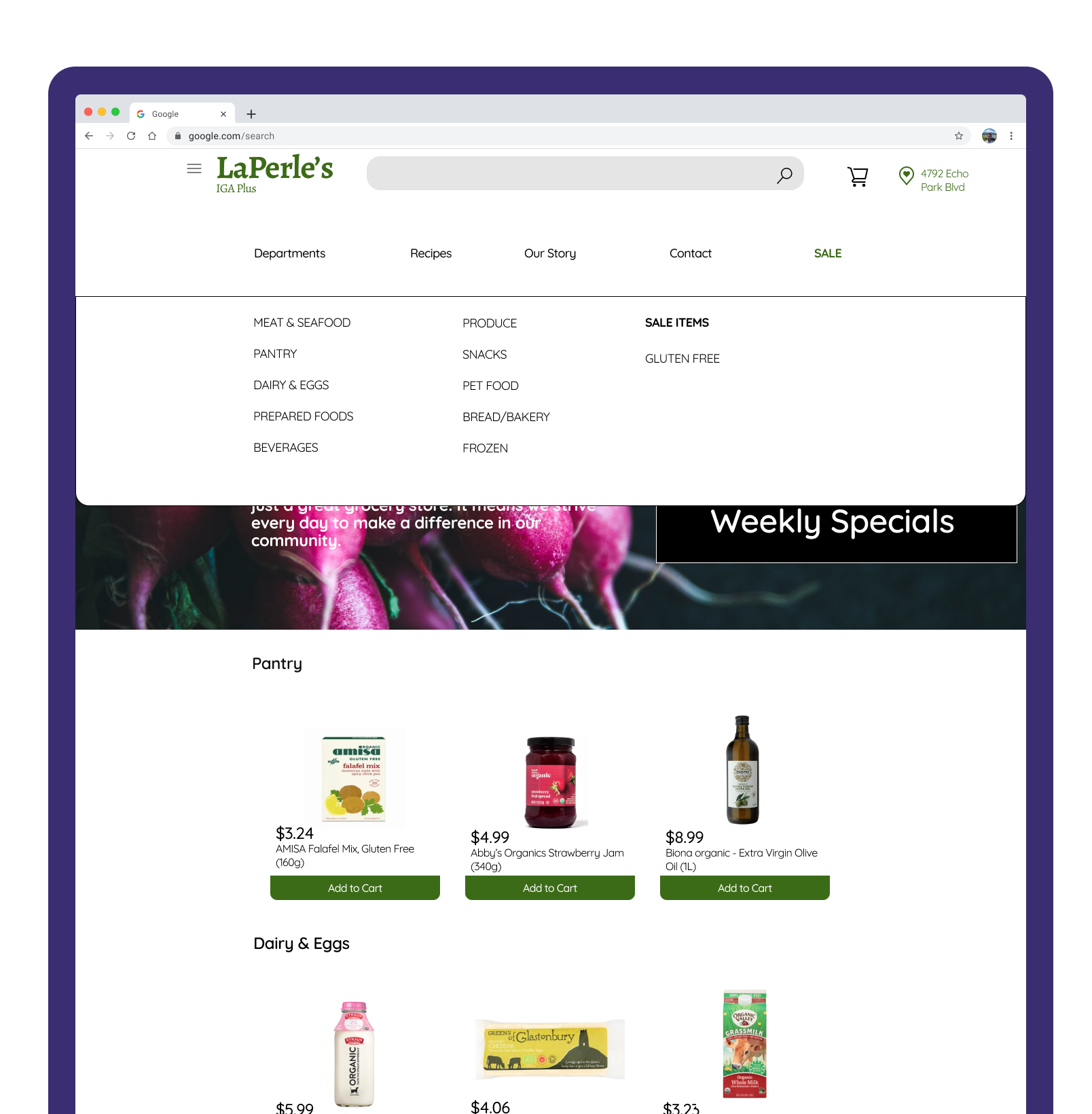
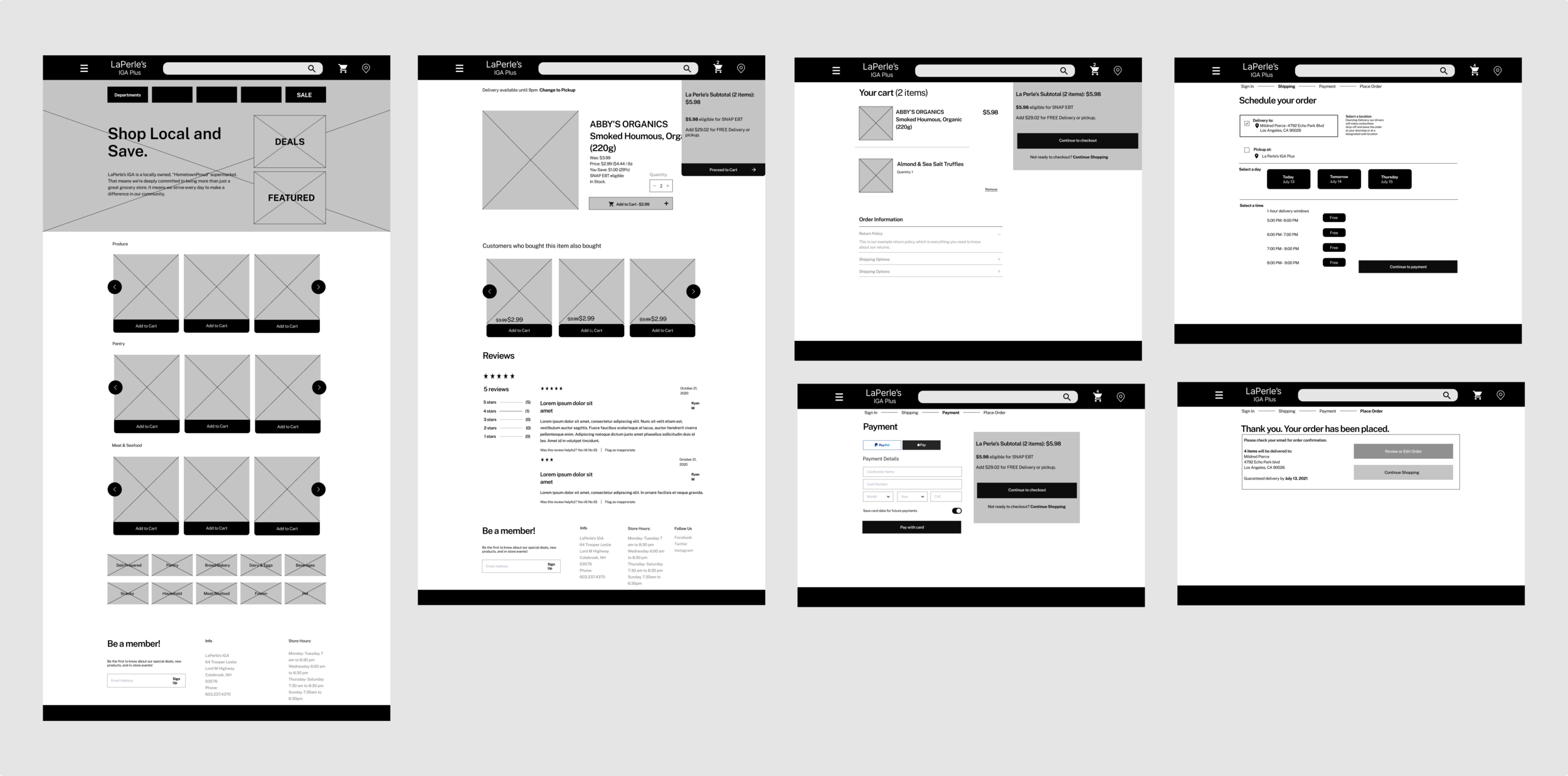
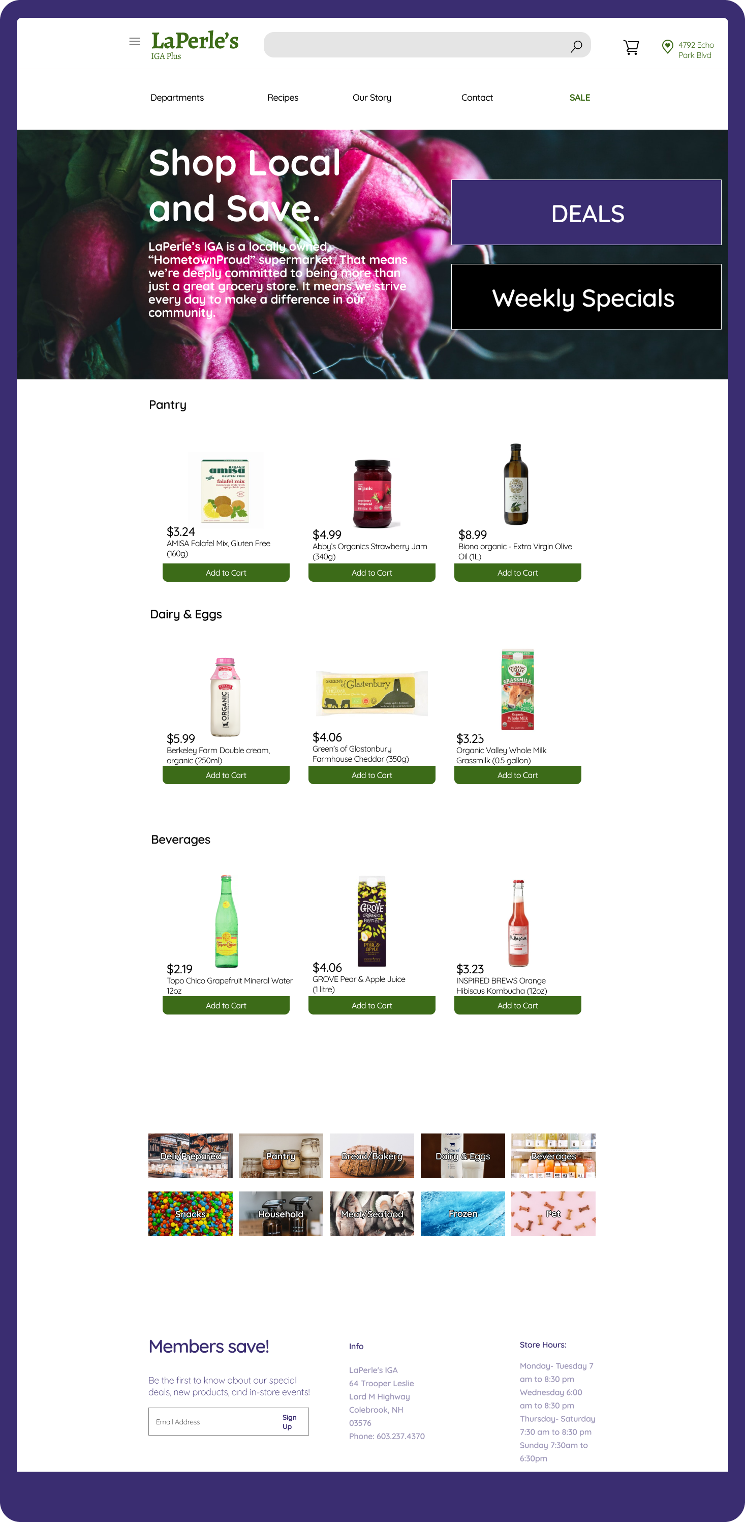
Departments drop down menu
Featuring categories, products photos with descriptions, organized by department based on the inventory card sort.

SALE
Sale categories are now consolidated into a drop-down menu, and the number of items is shown in the cart at the top.
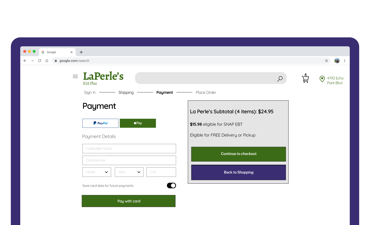
Payment
Easily enter card information and save for future purchases. Here we see the user has qualified for FREE delivery.
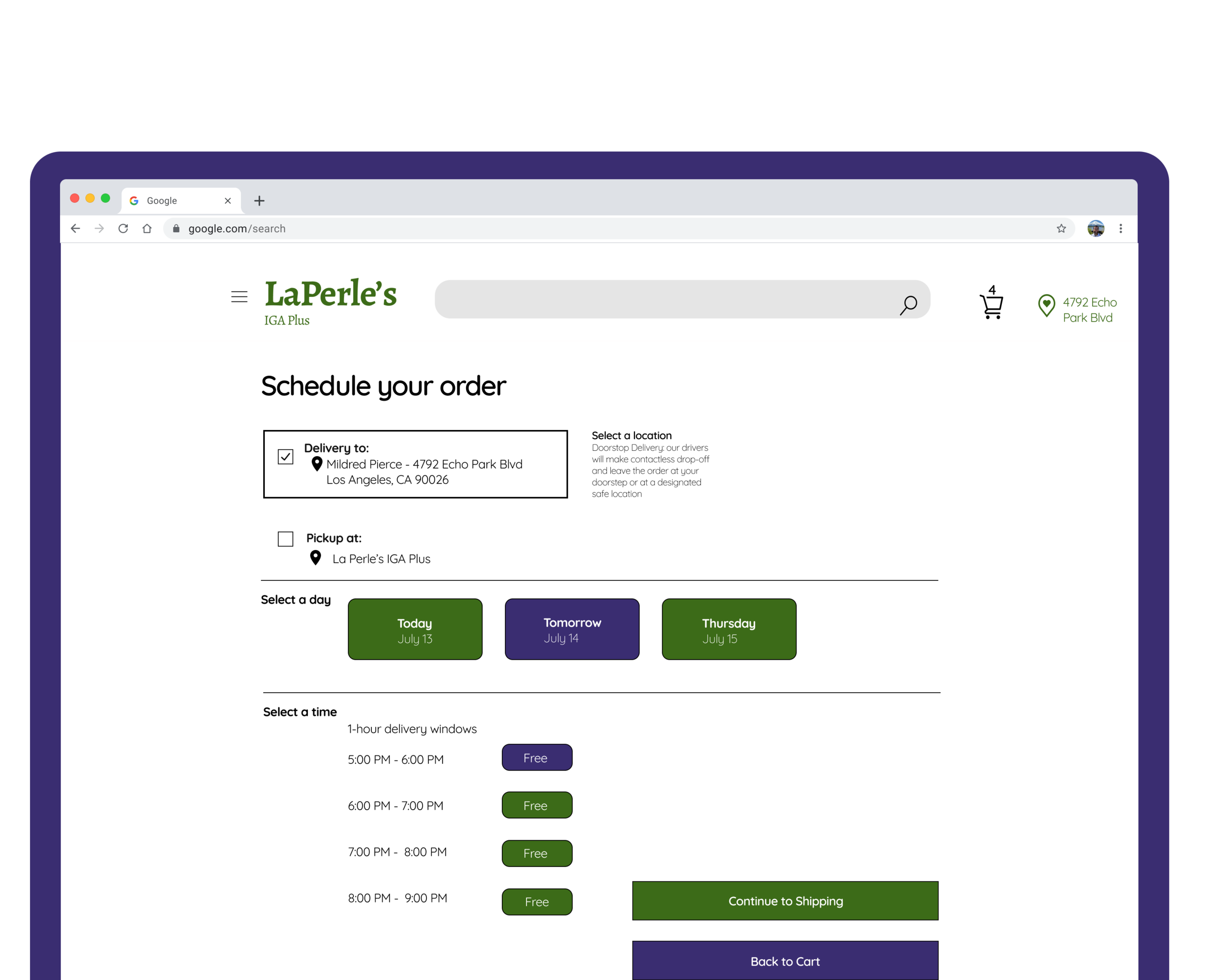
Schedule a Delivery
Here Mildred’s address is already stored in the system, she can select which day she would like it delivered and which delivery time window.
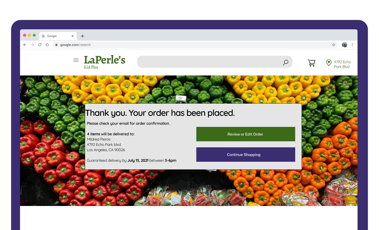
Thank you & Order Confirmation
Here the order has been placed, when and where it will happen. Also option to review or edit the order or continue shopping.
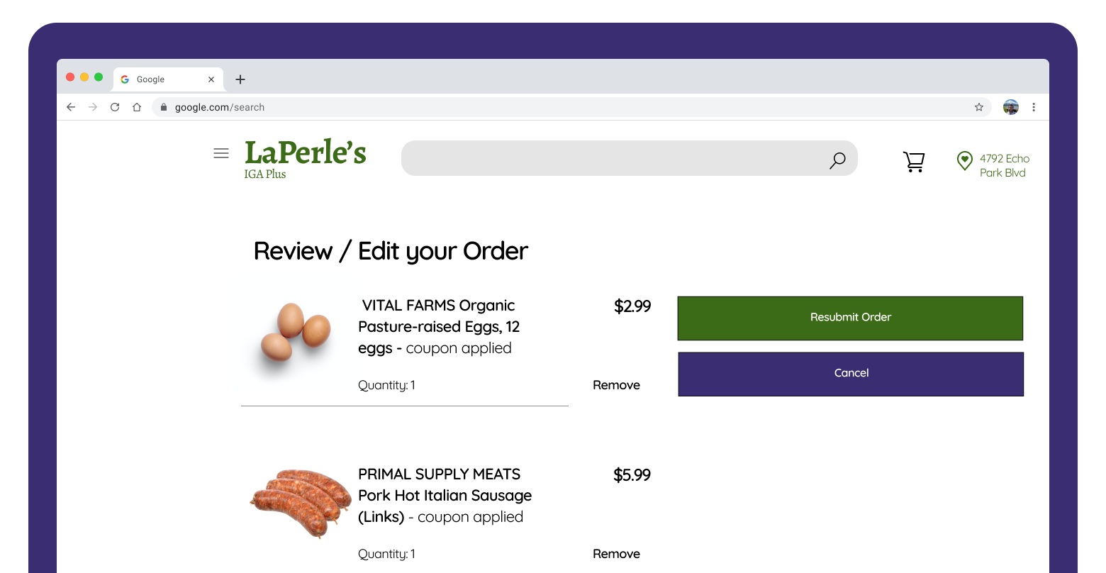
Review and Edit order
After the order is placed, or prior to placing an order, Mildred can review and/or edit items in the cart.
Conclusion & Next Steps
As my very first UX project, I’m proud of what I accomplished. It’s great to have gone through the UX process to experience it first-hand. Here are some things I’ve learned and what I’d like to do better next time:
1. I think Mildred would be happy with the new redesign and some big strides were made in her shopping experience overall. She could take advantage of the new sale section in the navigation being easily accessible, and also be able to access sale items from the home screen.
2. I would like to interview more grocery app users to find more pain points. This would better allow me to zero in on specific features rather than an entire redesign.
3. Spend more time iterating on prototypes by trying different designs, and testing them out on potential users. With only two weeks, this was a great jumping-off point, but there could have been more time spent on the prototype itself.
For the full clickable prototype click below👇
For more work inquiries, or to meet for a coffee to discuss more UX happenings shoot me an email at gabrielzevkenny@gmail.com
Thanks for reading!